Dunschtig,12 März, 2020
I have always been fascinated –and sometimes amazed – by fonts. Typography is extremely important both offline and online. Some logos are now made just from the typeface e.g. Salt, Burberry or Google (do I really need to post a link to google?!).
It is now very easy and free to access hundrends of free web fonts via Google Fonts (some are really excellent) yet seeying another website using Roboto or any of the ultra-famous google fonts isn’t that special.
Lately I have visited a local optician (“optiker” in German) because I realised that I couldn’t see very well from a close distance. To test your eye sight all optician use a Chart, also known as “Snellen Chart” or Logmar Chart to determine how good (or bad) our eyesight is.
Have you ever wondered what typeface is used for these letters? It turns out that creative ageny Anti created a free Optician Sans font.
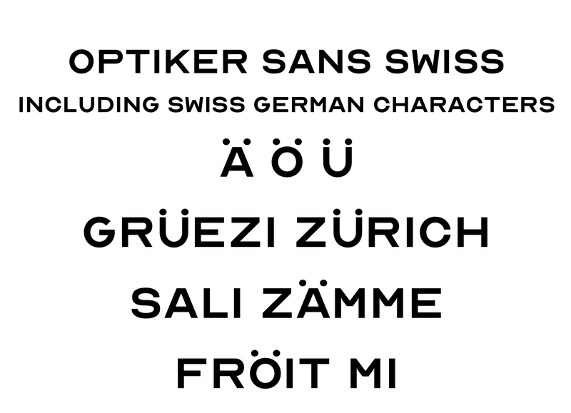
I think is an awesome typeface but..I noticed that important letters used in German and Swiss-German like öäü were missing. So I created a new font (thanks also to the SIL Open Source license used by Optician Sans) called “Optiker Sans Swiss”:

Here you can see the charcaters I added and some pratical use in Swiss German
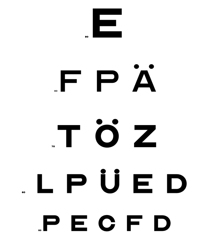
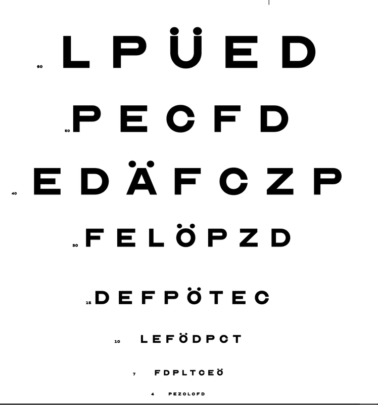
and an Snellen Chart Swiss German edition (in reality these charts would never include öäü and other German characters but of couse if you want to use the font to type an address you need these special characters).


To edit and re-create the font I have used glyphs that wasn’t as user-friendly as I expected, yet I enjoyed the challenge.