Ziischtig,04 Auguscht, 2020
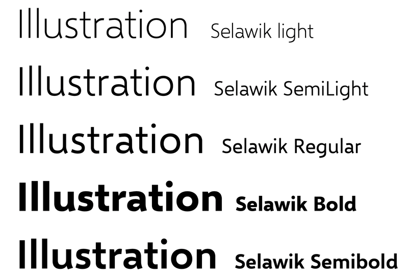
Selawik was released by Microsoft as an open source font as a replacement for the proprietary Segoe UI. This is pretty significant and unthinkable (Microsoft and open source?) just a few years ago. They even release the glyphs source file. Wow!
This is not broadly advertised so a bit of a niche font. I do like the many great fonts available for free on Google fonts but I am always more intrigued by something not as widely used yet distinct.
I found this font to be interesting but it also suffers for the confusing capital I that looks too similar to the lowercase l. This is what I mean:
I have already discussed this before (see https://david.dev/arial-vs-helvetica-vs-tahoma/ ) so since the font is open source I thought it would be interesting to fix the I so here is the DavidDev1 font with fixed I
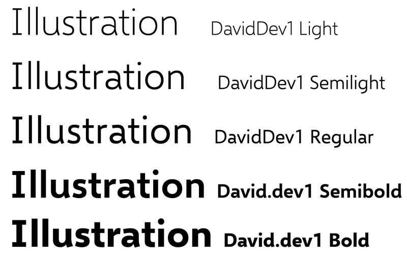
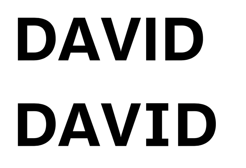
just one letter changes makes a lot of difference in terms of legibility. I updated to the full version of Glyphs https://glyphsapp.com because the “mini” version doesn’t allow to fix multiple layers/weight.